Have you ever come across a website that did not look usable? That is where the term “usability” comes into context. Usability helps determine how your website will perform and what you need to do in order to make it more useful.
So, here are the top 10 characteristics that your website should have if you want to garner more audience and increase your sales. But, first, let’s look at how users think and what they land on a website.
What Do Users Expect from a Website?
Users on the internet work exactly like in-store customers. They make an impression of your offerings based on what you show. If something vaguely interests them, they click on it and search for similar products.
Hence, the goal is to present something useful that the client will get as soon as they come to your website.
Users perceive the image of your brand through the quality of your website. If your website looks credible to them through the content you have, they will definitely value it over the design. That is because most users are looking for what you offer instead of visuals.
Secondly, users scan through your text. They notice the hot areas on your web page and see if the content matches their interest or not.
Another thing to take care of is the cognitive load. The more content you will stuff on your website, the higher the cognitive load will go, and the website will become less intuitive. Users like to have control over the website, which decreases due to all these factors.
So now that we know how users think when they arrive on your website, let’s move on to the next important part: the top 10 principles that you should include in your web design.
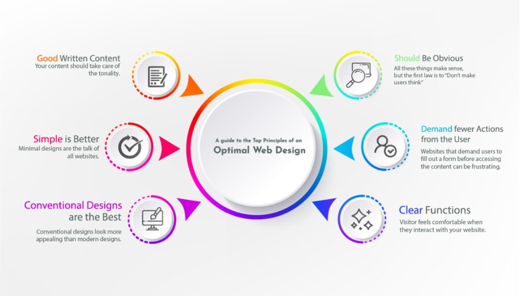
Your Website Should Be Obvious
Steve Krug is a famous user experience professional who defines how the usability on your website should be like. All these things make sense, but the first law is to “Don’t make users think”.
A user should immediately know and get what is happening on your website. They should put in no effort to understand how the website is designed.
When you’re designing your website, it is important to get rid of all these question marks on your website. Everything should follow a clear structure and your audience should be able to easily navigate through your website.
By reducing the amount of cognitive load and increasing the intuition on your website, the visitors can grab onto the concept and understand the elements of your website. People will not use your website if they fail to find their way around it.
Demand fewer Actions from the User
Websites that demand users to fill out a form before accessing the content can be frustrating. If the website prompts the user with something they don’t want to do, it is likely that they will get off your website.
It is ideal to remove all hindrances that may come in the way of user experience. If you want to register the user, an email address is enough to get them on board without demanding too much work from them.
Increase the Attention Span of the User
Websites are both dynamic and static, they help users interface the information through graphical elements. It is no doubt that graphical elements help perceive the information better.
That is because the cognitive ability of the user is strongly linked to recognizing patterns and motions. That is one of the reasons why video-based advertisements capture the attention of the user even though they are very distracting.
A better sense of orientation on your website is only possible if you include fewer unanswered questions on your website. In other words, the less thinking the user has to do, the better will the experience on your website.
Clear Functions
A clear architectural structure on your website combined with a great visual appeal is extremely effective for visitors. Large buttons that show functions make the content on your website very simple to follow in a user-friendly way.
Displaying the functions in a clear manner is a primary principle for an optimal user interface design. The implementation is all that matters, not the way it is achieved. You have to make sure that the visitor feels comfortable when they interact with your website.
Good Written Content
Your content should take care of the tonality. You have to make sure that the niche you’re writing about resonates with what you offer. For example, if you are a casual business, then a few informal words won’t do any harm.
However, it is best to stay concise and to the point throughout your content. Also, make sure that your content follows a defined visual hierarchy. Include lists, headings, changing font sizes, bold, italics, and other typography elements in your website.
Simple is Better
Minimal designs are the talk of all websites. Most websites underestimate the power of white spaces. Users are looking at your content instead of the design. Hence, it is best to think from the user’s point of view and display your information through a minimal site design that captures the essence of what you offer.
Reduce the Cognitive Load
As mentioned earlier, more content leads to more cognitive load. An increased cognitive load can overwhelm the user and make it impossible for them to process the information. When new users arrive at your website, the first thing do is scan the content.
A complete structure is hard to read and makes it even harder to take away something. That is where hierarchal structure come in and helps reduce the complexity of the content. Including white space and using contrasting colors that blend well in the layout of your website is crucial.
The Use of Visible Language
Visible language includes three primary elements:
• Organize
• Economize
• Communicate
Organization of the language means delivering clear and consistent language throughout your content. Everything should be coherent to each and follow the proper layout.
Economizing means focusing on the clarity, simplicity, emphasis, and distinctiveness of the content. All these components are very important for effective communication on your website.
Conventional Designs are the Best
Your website does not look boring when you use conventional design elements. In fact, conventional designs look more appealing than modern designs. They help reduce the learning curve and help visitors figure out how things work on the website.
By following conventions, you land on user expectations and gain their confidence, reliability, and trust, while proving that the content you’re providing is credible.
You should only integrate innovation when you know it will work. Experimenting with different techniques can be detrimental.
Testing Your Prototypes
Testing how your website is working on the internet is crucial. It’s necessary to know how your website is working and how users are responding to it. The testing phase for your website is an iterative process.
The whole testing process gives you useful insights and helps you point out potential problems in your website design.
Conclusion
Working with a good website design company such as profession website design can help you gather the right audience. Our experts implement all these principles into the narrative of your web design. This implementation gives you stellar results and helps you attain the results you want.