Making your website design is no piece of the cake, but it isn’t that hard either. The usability and utility of your website are more crucial than the visual design. The visitor is responsible for deciding everything on your website. Hence, a user-centric design is the standard approach you should have for your web design. Design implementation techniques are widely available on the internet. Hence, in this article, we will be focusing on the main principles and approaches that you need to integrate into your web design.
The User Thinking Process
Users sit on the other side of your screen. You would view the web design from your point of view, but the user would have different expectations. The bottom line is that users on the internet react to products and services the same way they do in physical stores. Users are looking for something that would grab their attention. They appreciate the effort you put in which reflects through high-quality content.
Here are some of the factors that users look for in a website.
- The quality and credibility of your website matter a lot. Users perceive what they think of your website at the first glance. Hence, everything should be optimized if you want to increase the traffic on your website.
- Users want everything to be in front of them. They don’t have the time to read through long forms of text. They look at some places of your web design that display the text and make the required action. If they don’t find what they want, they won’t make action.
- Web users want instant results. If your website is not intuitive and lacks cognition, then it is possible that users will leave your website and look for other options.
- Users want to control. They want to browse through a website where they know what will happen. Pop-ups or unwanted prompts are unwelcome and give a wrong impression. They also hinder the experience of the users.
So, what are the top principles you should take care of when designing your website?

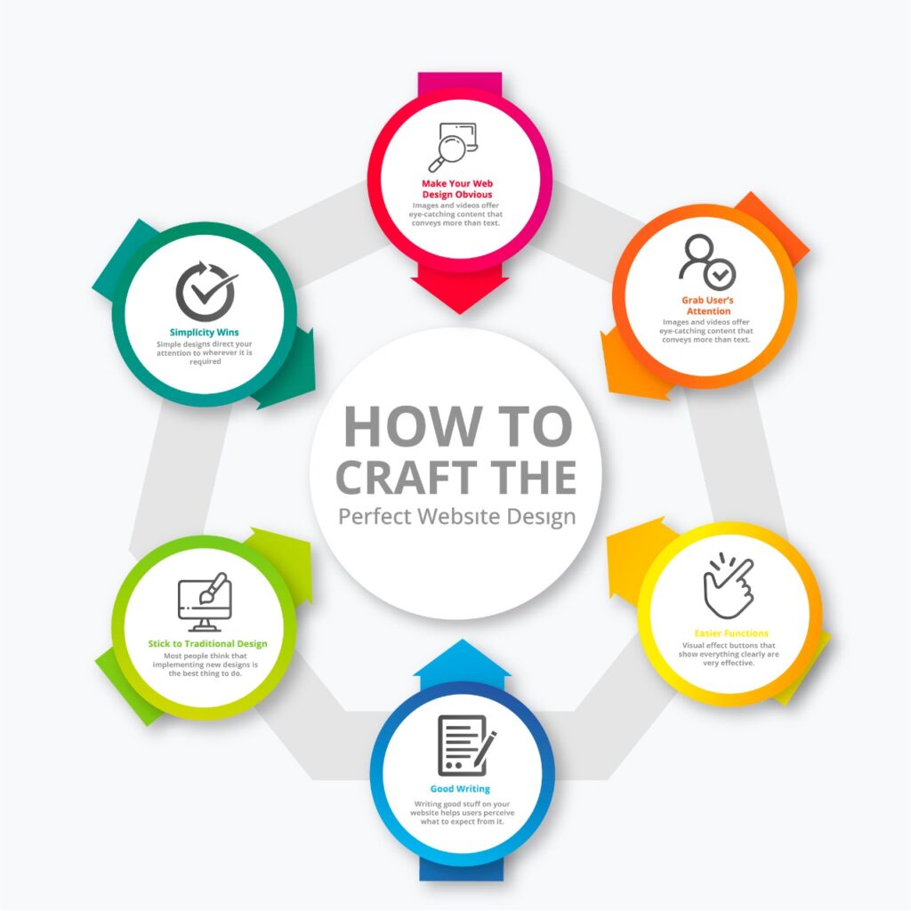
Make Your Web Design Obvious
Krug came up with the first law of usability. It forms the basis of the perfect web design. The law states: “Don’t let users think”. Hence, the entire design of your website will revolve around intuition. If users have to think about the next move they have to take on your website, it will hinder their experience. The satisfaction level would thus decrease and the user would get off from your website. So, a website that makes the users think and does not allow them to take actions consciously will ruin the whole web design. For example, if your website has a nice layout and the visual appeal is also great, but the text asks questions from the user instead of giving them the solution. That is where you know your website design is not compatible. Reducing the cognitive load on your visitors helps them grab onto the idea and understand what you’re trying to communicate.
Keep Your Requirements to the Minimal
You might have noticed that some websites ask for subscriptions and give users registration forms or other types of forms that they need to fill out before they can access your content. First-time visitors are looking for quick solutions without the need to share their personal data. Asking visitors to give their personal information before they can access the data is not right. A user-friendly website is what you need so the users can feel comfortable around your website. It is best to remove all obstructions so new visitors won’t have to register or subscribe to anything on your website.
Grab User’s Attention
It is no surprise that users want attractive visuals. After all, visuals convey more information than words ever can. Images and videos offer eye-catching content that conveys more than text. The human eye receives patterns and recognizes visuals and motions more easily. Hence, video-based advertisements create a greater impact. They are also seen as better marketing techniques as they do their job perfectly of capturing users’ attention. Including fewer question marks in your content leads to better visuals. It also provides a better sense of orientation for the users. All these factors combine to give a better user experience and usability to your audience.
Easier Functions
Functions are the core members of your web design. Without these functions, your website will have no use. Visual effect buttons that show everything clearly are very effective. Users find functions to be comprehensive. Hence, the fundamental element that proves to be effective is functions. That makes users comfortable with the website and enables them to interact with it effectively.
Good Writing
Writing good stuff on your website helps users perceive what to expect from it. Anything that promotes your services or products is not interesting to the user. Any language that looks exaggerated will be ignored by the users. Hence, you should jump directly into your business. Don’t try to include any useless content or clever names. Try to be casual but not too formal. Call to action is also part of your content. So make sure you use words that prove to be effective for your content. You should always use concise phrases that communicate the notion of your business. The language should be plain and should like you are trying to sell the product. Instead, focus on the pain points of your target audience and devise solutions for them.
Simplicity Wins
Simple designs direct your attention to wherever it is required. Users are not looking at the design. Instead, they want the information. That is why you should focus on your content before you start to focus on the design. A proper layout should always be there. Don’t overwhelm your user without stuffing unnecessary content and overcrowding your user with too much information.
Reduce the Cognitive Load
Reducing the cognitive load by including information in spaces is an effective way. The first thing users do after accessing a website is to scan it. They then divide the pieces on your layout and look for the information they need. If everything on your website is jumbled up, users won’t be able to find what they want. That would ultimately lead to them leaving your website and looking for information anyplace else. Hence, managing the hierarchy of your content reduces the complexity it has. The reduced complexity will let the users perceive your content in a better way.
Screen Visible Language
Online visible language helps to organize your data and give a clear and consistent structure to the information on your website. All the elements on your website should be well-linked together. Your content should also have higher readability and not include complex words. The content or language you use should have clarity so that everything on your website makes sense. Also, make sure that everything on your website can be distinguished so nothing gets mixed up. Lastly, take care of the elements like typeface and point sizes as they help balance the legibility and texture of your website.
Stick to Traditional Design
Most people think that implementing new designs is the best thing to do. However, that does not hold true in the case of web design. People like to follow traditions. That is why a traditional website that follows users’ expectations is what you want. Understand that they’re expecting a full navigable website that is well-placed and has everything they need.
Only innovate ideas when you know they will work. Trying out a new web design just for the sake of experimentation can take away advantages from you.
Take Care of Insights
After your website goes live, you should keep track of its performance. The testing phase is iterative, which is why you need to constantly monitor how the design is working for people. The rule here is simple: design a website and roll it out. If it doesn’t give the results, design again and put it online.
Conclusion
While creating a web design may seem like a daunting task, we at Go Digital Initiative make sure that our team of experts makes everything easier for you. We come up with sustainable solutions that give your website a unique touch. Our aim is to deliver websites that drive traffic to your business while increasing your visibility. So, if you want to put your website to the test, our services are where you need to go.

Leave a Reply