The user design and interface are perhaps more important than the visual design. They help to mark success or failure. That visitor is going to decide whether to or not to click on your website. Hence, it needs to be user-centric and serve as a hassle-free option for the user so that the user would click on it and generate more revenue for you.
Let’s Talk About Usability
Usability is different from visual design. It is what determines the success of your website. But, we aren’t going to talk about how to implement the design. We would be more concerned about the main principles and approaches you need to have to make your website effective.
The Dos and Don’ts of Good Website Design
The first step toward a good web design is to see how your target audience will interact with the website. It also helps to analyze what the basic patterns of the users are like on your website.
Understanding How Users Think
People on the web are the same people who go to stores and choose products. Hence, their habits are not different from those who use the interest. Visitors take a first glance at what your website offers, read the text, and decide whether or not to stay on that website.
Users search for something and see if they find it interesting.
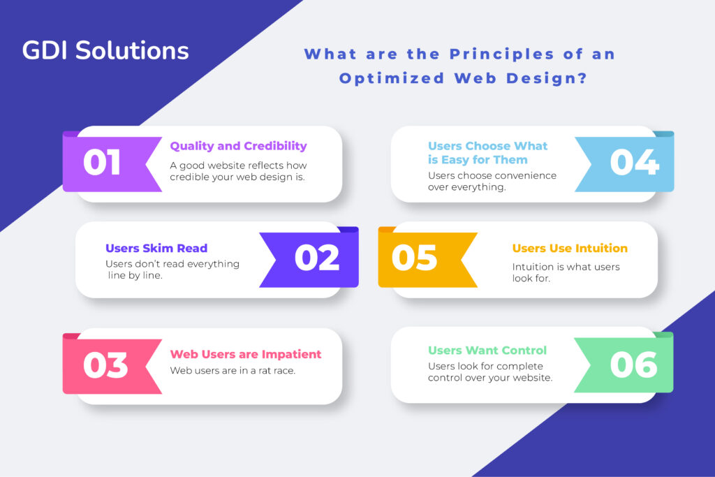
Quality and Credibility
A good website reflects how credible your web design is. It is a pivotal element that helps the visitor take a decision. That reflects good quality content for a website, which is why the content is more important.
Users Skim Read
Users don’t read everything line by line. They scan the entire text and find what looks interesting to them. Those points are the anchor text values that help the user decide whether or not the company or business offers them what they want.
Web Users are Impatient
Web users are in a rat race. They want quick results without losing any credibility. If the website lacks intuition and does not have the cognitive ability, the user will leave the website and search for other options.
Users Choose What is Easy for Them
Users choose convenience over everything. They don’t look for the best option, rather they see what brand offers what they want ad how easy it is to use their website.
Users Use Intuition
Intuition is what users look for, if they don’t understand the website and are not able to navigate through it, what good will that website bring? Your audience should be able to understand where everything is on your website.

Users Want Control
Users look for complete control over your website. That doesn’t mean they get to change the layout. It means they would want to know what will happen next and be aware of everything happening on their side of the server. For instance, windows popping up when they’re using a website is usually not a good element to include in your website. It diverts the attention of the user and irritates them.
Since now we know how to deal with these websites and how users think, let’s move on to what principles you should include in your website design.
-
Make the Website Self-explanatory
Usability is a term that determines how your website should be obvious. Your main job is to evade all the questions on your website. Users need to arrive at their points themselves. Hence, a complex website will make them confused and not want to stay on the website.
If the site architecture does not have the right consideration, it will make it difficult for the users to understand how to navigate on the website. Every element on your website should have a clear structure and some visuals that help users pave their path.
Reducing the cognitive load on the users makes it easier for them to understand what is happening and what your website is trying to communicate. Once the website succeeds in communicating your ideas, you can then help the visitors see how your brand is there to solve their pain points and give them what they’re looking for.
-
Don’t Demand User Work
Users tend to be lazy and want everything served. Hence, testing their patience with more actions is like making them work for what they don’t want. That is why they would prefer to go to other websites and try their services.
For instance, a user arrives at your website and you present a long-form for them to fill out before accessing your website. The use would eventually go to the other website as they would see the long form as something which would waste their time.
It is not necessary to demand users to share their private data. If you want them to subscribe to something like a newsletter, you can prompt them to click on a single button. That would make things easier for the user. However, it is best to remove all barriers and hindrances.
-
Grasp the Attention
User attention is what you want and need for the growth of your website. Images are proven to give more visibility in contrast to just text. That is because a single image can imprint itself in the user’s mind and communicate more than text.
Web users harness the power to recognize patterns and motions. Hence, including video-based content is also another helpful element you can employ.
The best thing to do is to use a moderate amount of visual elements equipped with some text that will help the user navigate through the website. A better sense of orientation is only driven by fewer questions that users may have on your website.
-
User-friendly Navigation
Giving guidelines are very effective. They help visitors navigate the site content. A clear site structure with visual appeal makes a user-friendly website. Increasing the functionality of your website helps see users clearly see what they want. It makes users feel comfortable within the environment of your website.
-
Effective Writing
Writing that speaks to your audience is effective. Writing that includes long paragraphs is not useful to users. They won’t even read it. You need to talk business and get to the point. Avoid using difficult words or technical names. For example, if you want the users to take action and contact you, a call to action button that says “Click Here” is better than “Start Now”
-
Minimalistic Design
The primary goal for any website is to make things easier for the end-user. This includes keeping everything simple and minimal to the user. You have to add to the experience and give the information despite the design. Complex designs make look beautiful, but they do not follow a visual hierarchy.
Lack of understanding thus leads to websites that have no context, which is a problem, for the users.
-
Include Blank Spaces
Not including enough white spaces may lead to an increased cognitive load, which is not a good thing for visitors. The first thing users do after coming to your website divides the content into small pieces. These small pieces of information help to categorize everything and arrive at an answer.
Complex structures increase the complexity level of your website. The better you are at managing the information on your website, the better your content will be perceived.
-
Effective Communication
Effective communication is based on the following important elements: Organize, economize, and communicate.
Organize is to make your website navigable. It has to depict a clear and consistent concept. On the other hand, economizing means including visual elements for your website. Your elements should have clarity and distinctness that allow the important elements to be perceived by the user.
Communicating is like using easy words. That includes the readability of your website, its legibility, typography, and how everything is brought together. Your web font should be readable.
-
Use Traditional Designs
New designs may look like something out of the box, but using too many of them can be harmful. Thus, conventional designs are always the safer idea. They also reduce the learning curve for your user so that they won’t have to figure things out on their own.
Hence, it increases usability, which is the number one trait of a good web design. Conventional designs also land on what people expect from your website. It is better to give them what they expect and only include innovations when you know they will give better results.
-
Testing and testing
Practice makes improvements for anything, but for websites, you constantly need to test them. Testing provides valuable insights to your website and gives a proper layout. Hence, coming up with a strategy to test your websites in a given timeframe proves to be beneficial.
Testing is also an iterative process. It focuses on a trial and error method. That means you design something, put it out, and see how the results are. If the results are not satisfactory, you go back to the design process and continue doing this till results show up.
Conclusion
GDI Solutions provides the best web designing services. We include everything there should be o your website. Our aim is to make websites accessible for all users so your visibility increases.
That is why our talented experts incorporate every element to make user-centric content and include a visual hierarchy so everything is well laid-out on your website.

Leave a Reply